Retirement Investing
A new feature provided by SigFig, allowing users to learn, track and invest for their retirement.
2017, UX, Design Lead
SigFig mobile app provides users easy access to their investment. To successfully bring peace of mind and inform users properly, we re-designed the app.
I led a iOS and Android mobile redesign project in collaboration with Product, Engineering, Design and Leadership team. Overarching the user experience of the redesign, and the design process.
SigFig app was originally started as a portfolio tracker app, serving self-directed investors who are interested in the daily performance of their investments all aggregated on the app. With SigFig providing asset management platform, it became important for us to communicate what we've been doing and provide investing advice for the users.
Talking with the support team and looking at the app usage helped us understand what are the things that clients attempted to achieve by using the app.
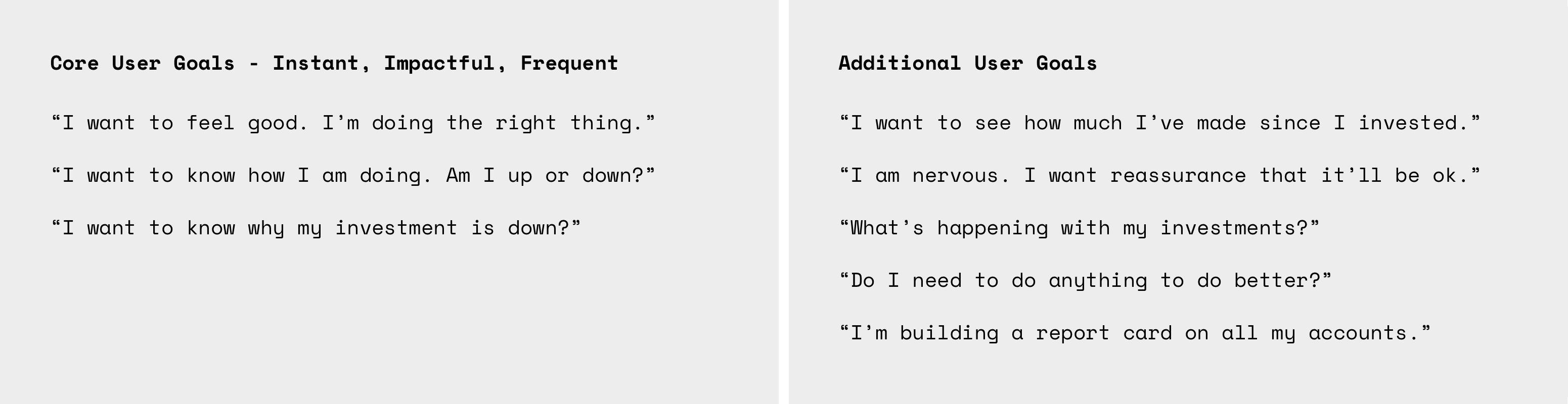
Internally, the team conducted a research to understand the user's goal better. Clients looking for quick reassurance on their assets when on mobile.
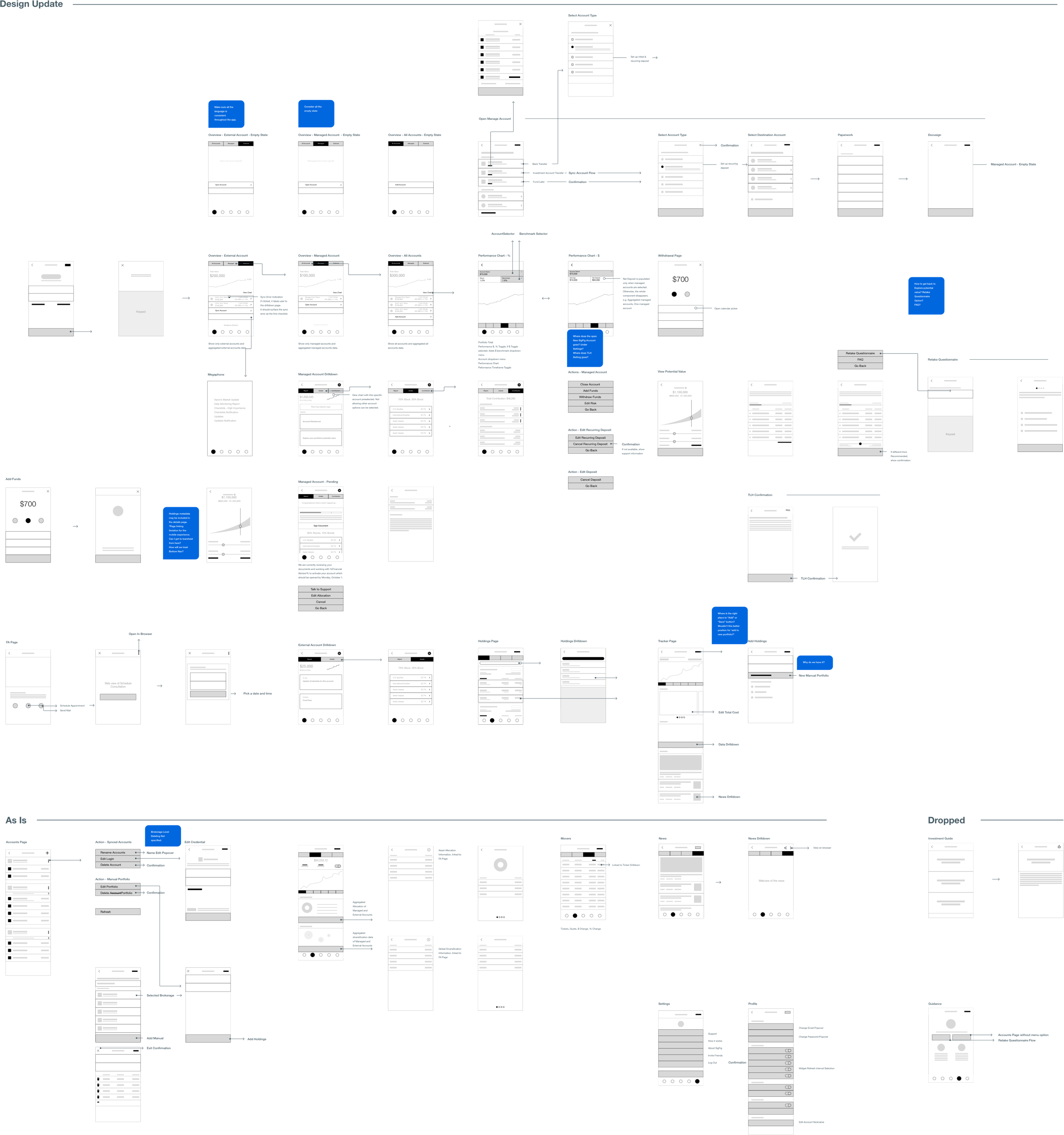
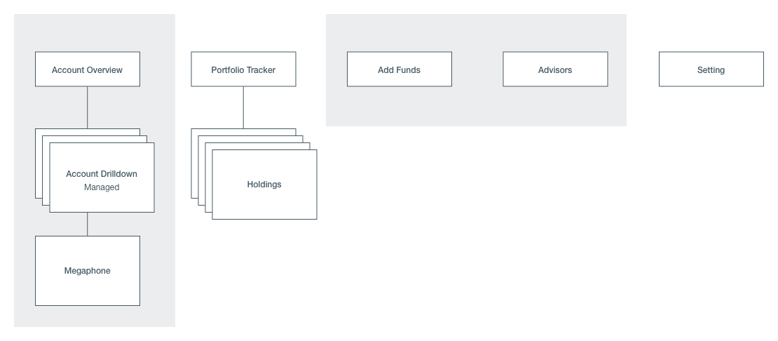
To inform the internal team and to start the design process with a better understanding of the app, we started with creating end-to-end user flow map. This process allowed us to discover opportunities to improve parts of our experience as well as data constraints.
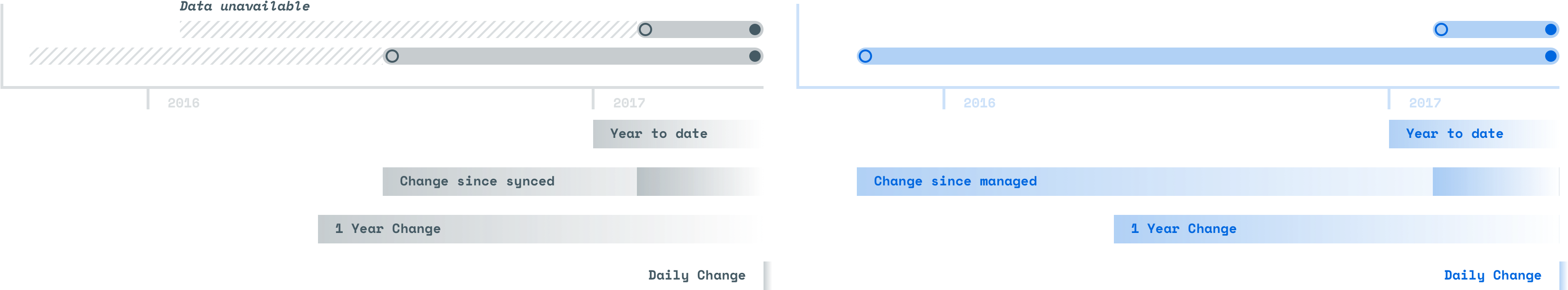
We discovered interesting data discrepancy that comes from 'when' the client had synced or opened managed accounts. For newly opened account, we could provide the entire history of the asset. However, for external accounts, we could only present the data from the date it was synced even though the account may have opened while back.
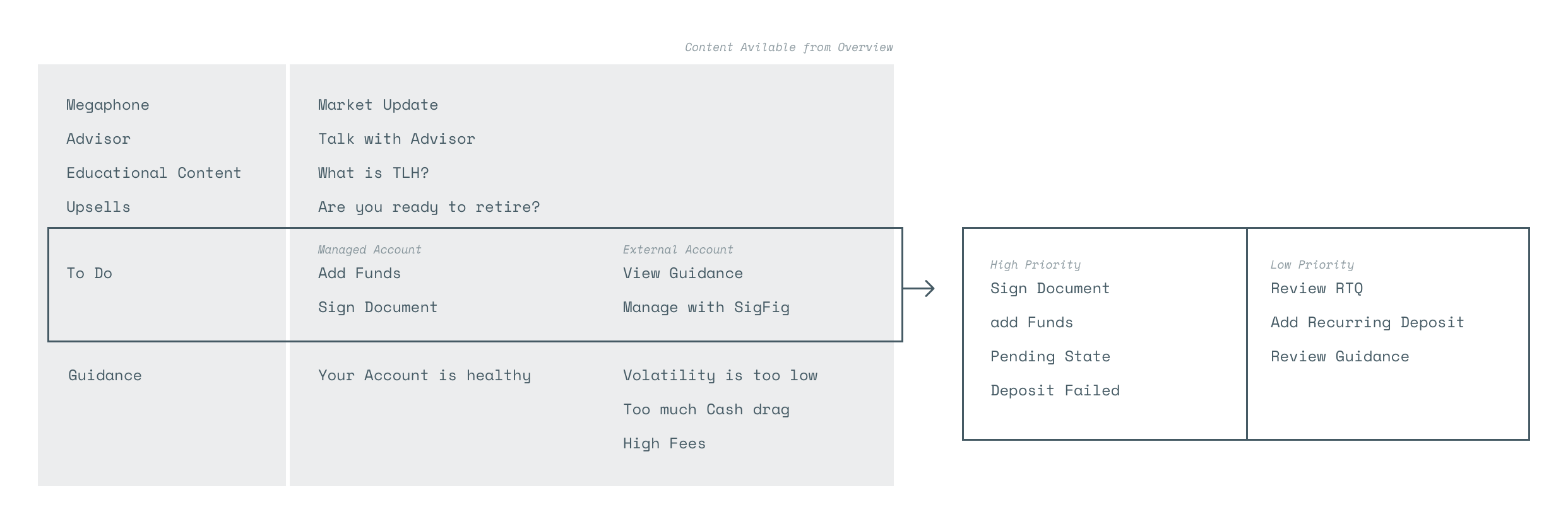
For a quick release, we prioritized based on what we learned from the user flow mapping exercise. We decided to focus on the overview of the investments and keep the rest for a simple optimization.
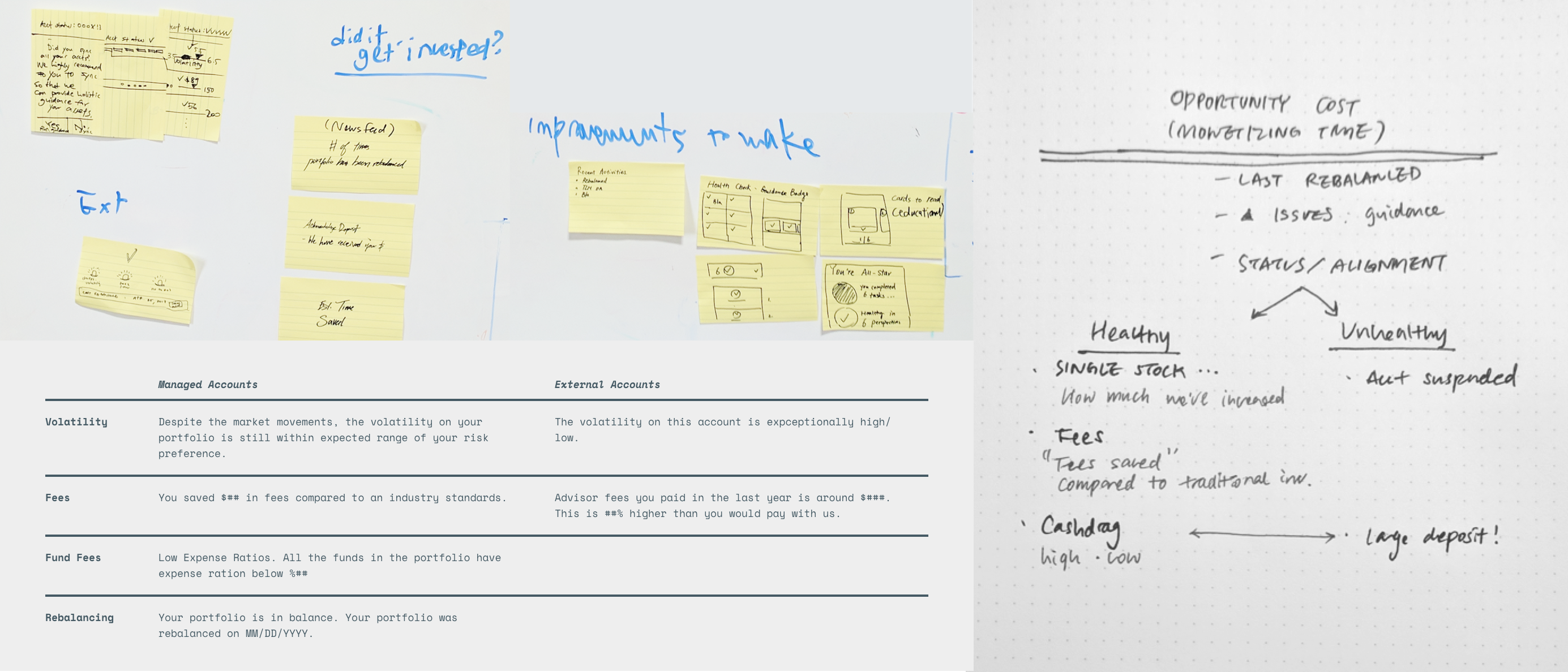
Through our advisor calls, clients often ask 'What's happening with my investments?' SigFig has been a data aggregator in the past that financially savvy clients used it to have a detailed view on their assets. However, many new clients who are investing passively cared more about what has SigFig done to manage the investments. We needed to set a place to clearly communicate the investment updates for the clients.
When a client starts investing, they are in a 'testing mode'. They start with a smaller amount and checks performance frequently to make sure that they made the right decision. Clients often keep a close eye on performance while other important parts of investing were neglected.
When a client is logging into the app, they want to confirm the status of the assets and often under a stress. On Appstore and Google Play review the most comments were about syncing issues, noticeably among tracker users. With the update, introducing an extra page dedicated for managed account clients could potentially increase the stress level of these clients. So instead of mixing those two use cases together, we decided to clearly separate them and provided a way for them to set a home screen.
We also brought the deposit and advisor feature accessible directly from the global navigation to support the main use case of the managed account clients. Instead of setting up a recurring deposit, we noticed clients adding a one-time deposit being more common, therefore easy access to the deposit page is important.
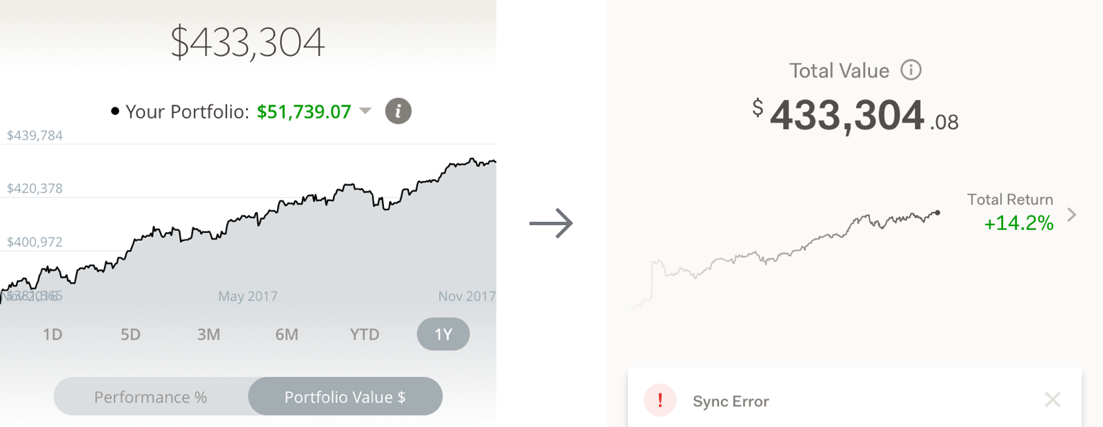
Investors often make a mistake of reacting to a market downturn frequently in a short period of time. We decided to make the very first indication of the detailed performance simplified.
It's been a few years since there was a major update of the app. To smooth out this process, we included the tutorial as part of the experience. Most importantly, we wanted to make sure that we bring the portfolio tracker users into the right place.
We developed a clear rule for each component based off of SigFig's existing visual style guide to iterate efficiently. We proactively converged and diverged the UI components based on their functionality and patterns in collaboration with engineers.
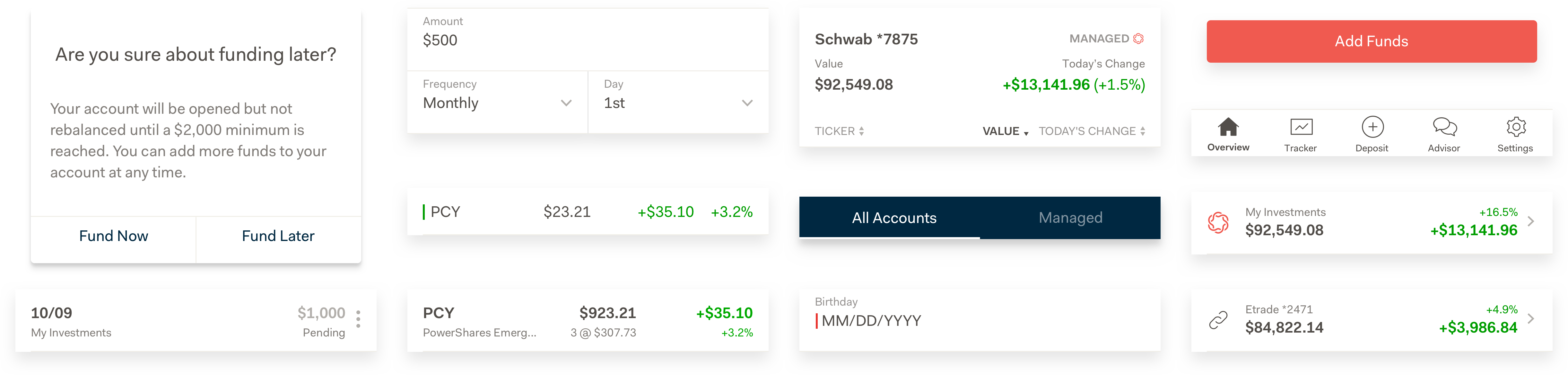
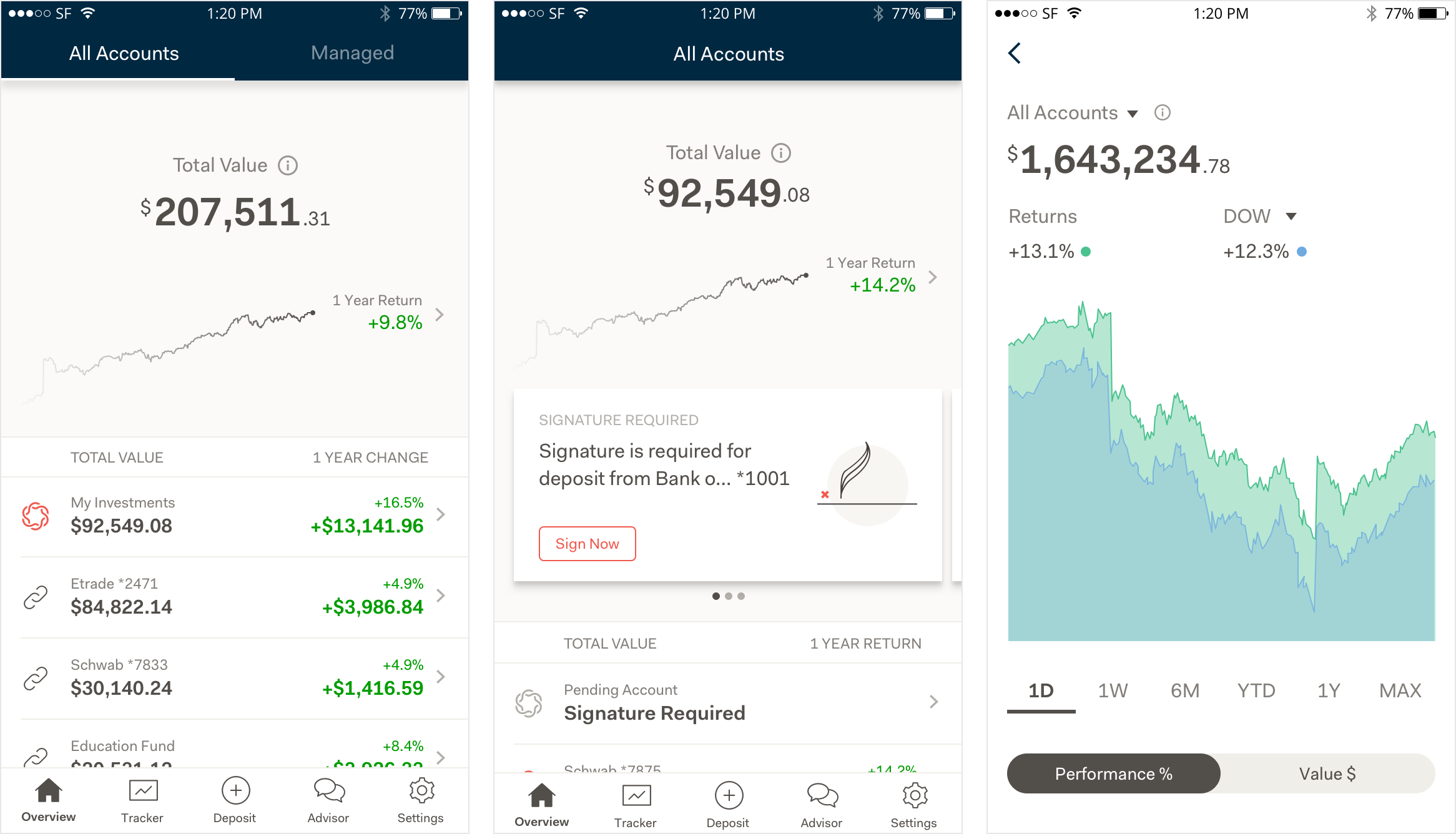
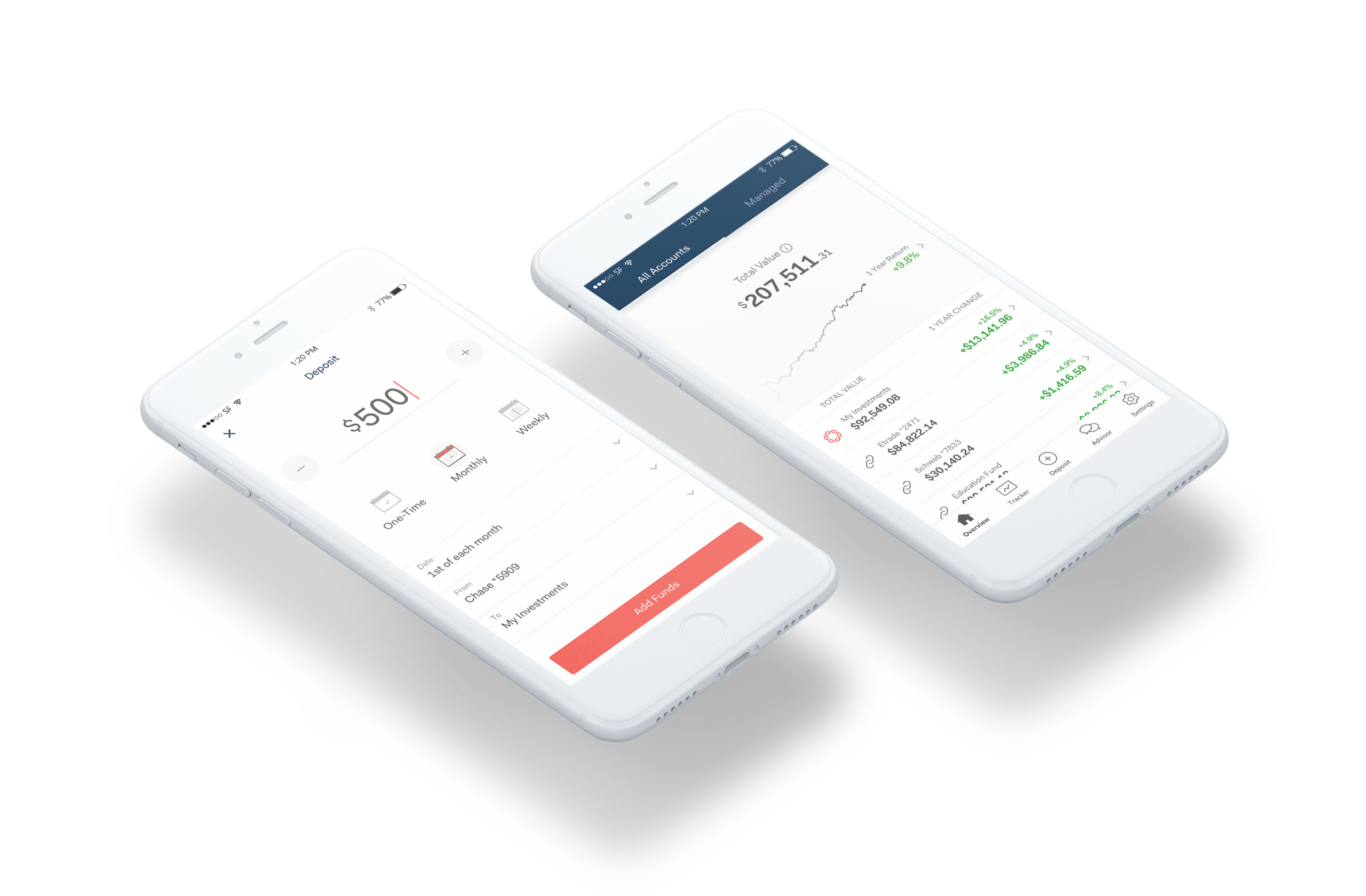
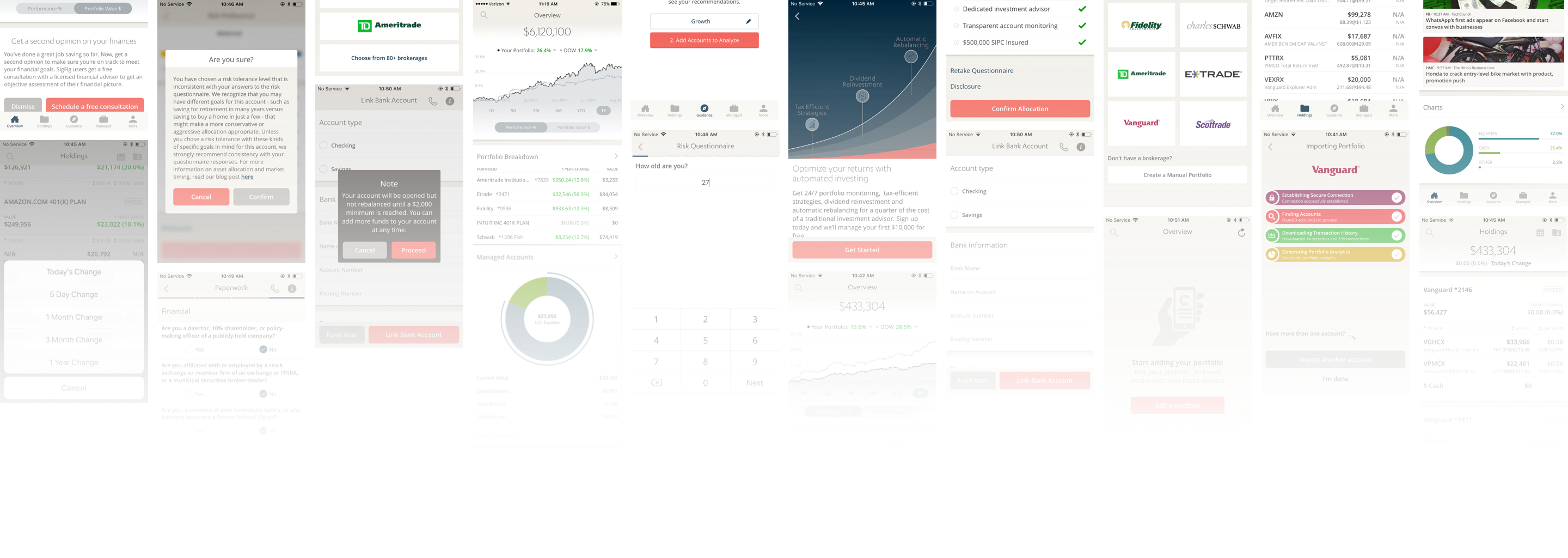
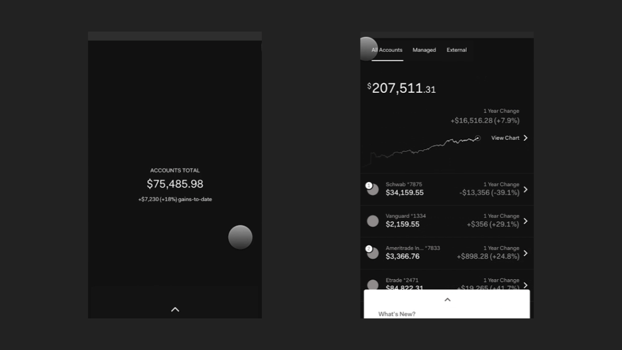
Overview PageOverview page brings access to all accounts that users linked to the app. This includes any external accounts and managed accounts.
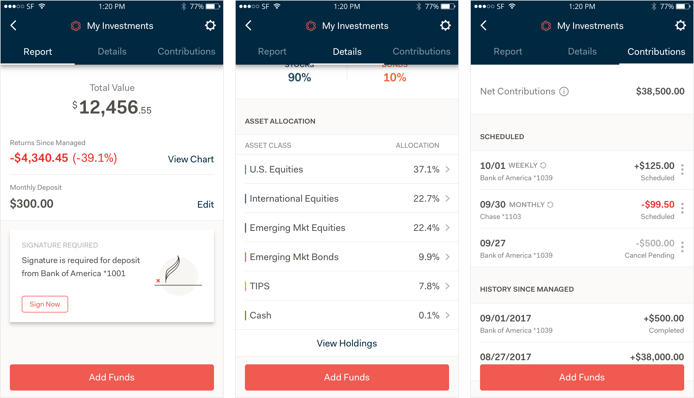
Account Page, Deposit historyWe included contribution history in the account page where users can see the account specific information. Here, they can find any actions that they need to take to successfully open accounts.
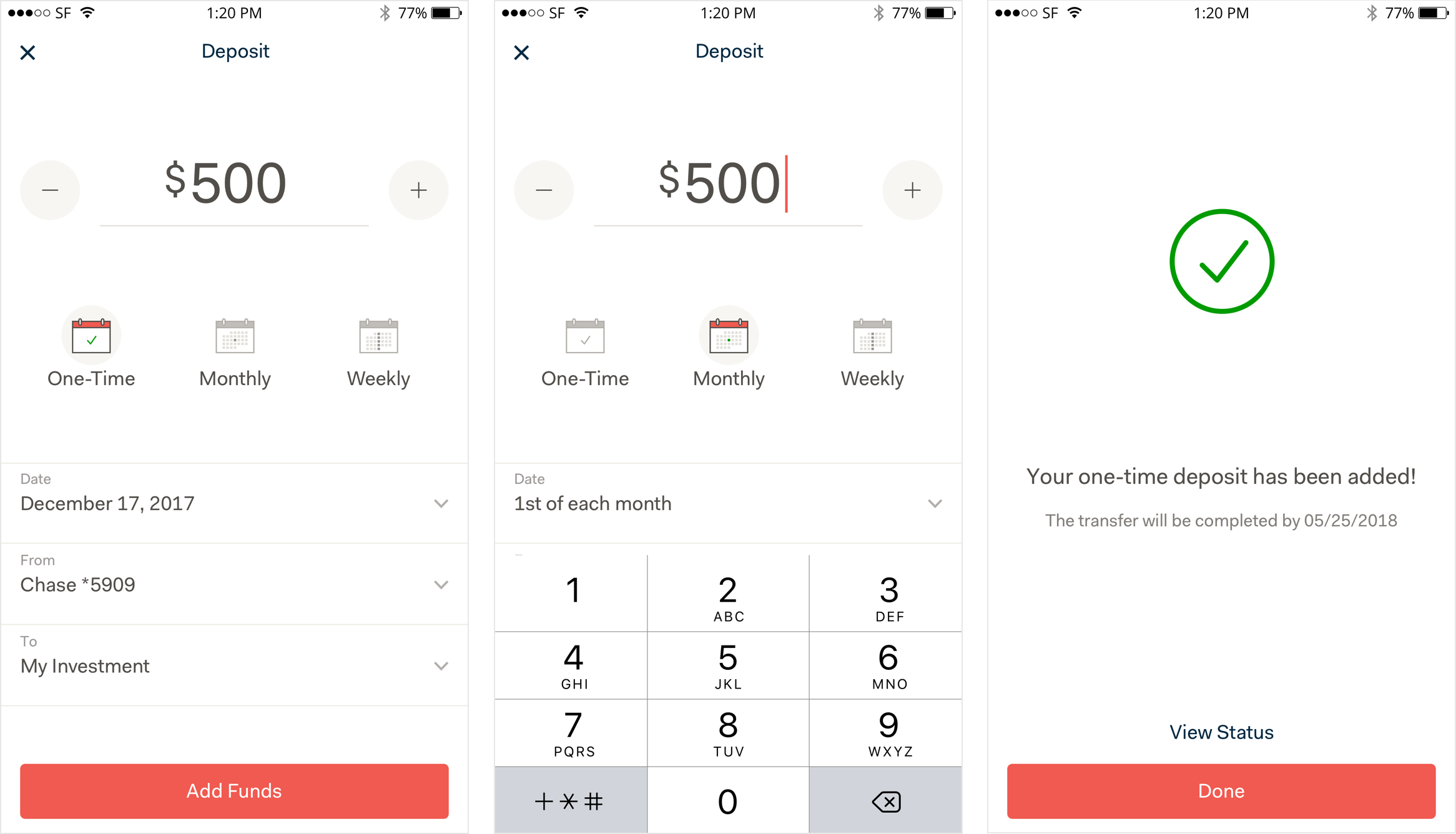
DepositResponding to a user feedback, we brought the deposit feature accessible from the main navigation.
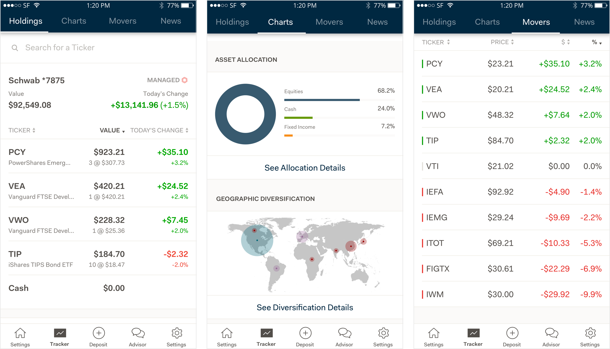
Tracker PageProvides detailed view on assets. It supports the users who are seeking for easy access to their investment's day-to-day changes.
After the launch, we noticed two very different reactions from users. As expected, we received comments from tracker users not being able to see the data points that they used to see. Meanwhile, we received emails and positive comments about the update being easy to use from the managed account clients.
We quickly noticed that the home screen set up notification wasn't actively utilized as the users simply skip the introduction which resulted in the tracker users getting lost. The team reacted quickly to bring them into the tracker page by looking at the app usage and send notifications to the clients who only had the synced accounts and utilize the app in daily basis. This impacted the feedback and ratings significantly.
It is important to allocate time for the team to react after the launch. We listed out a potential churns from the users with the updates and prepared options to react ahead of a time.
Always listen to what problems clients are trying to solve, but also make sure what is for the betterment of our clients. It is important to provide a good investment advice and create experiences that helps clients form a useful habit.
By doing so, we were able to discover data limitation early and naturally opens up a discussion to find a creative solution for the problems that we faced on the way.
A new feature provided by SigFig, allowing users to learn, track and invest for their retirement.