Identity Smart
User experience design process for a identity monitoring service.
Released on August 2018
SigFig Retirement provides a way for users to identify retirement readiness, outline the strategy, and invest towards the goal. It onboards the clients through a step-by-step journey tailored to their goal.
I was a product designer for this project designing an onboarding experience for the retirement investing, in collaboration with a Lead designer, Product Manager, and engineers. I was also responsible for running the usability testing and iteration, support engineers by communicating design with prototypes.

Retirement is a major factor that defines one's financial independence and stability. As we get deeper into viewing investment as a method for our clients to achieve the lifelong goal, helping clients save enough to retire was surfaced as an important goal for us to tackle.
Historical studies about the people's reaction on investing showed us that investing is simply a tool that people opt in for solving their jobs to be done. we started the project with a new perspective by looking into how these jobs are currently being solved.
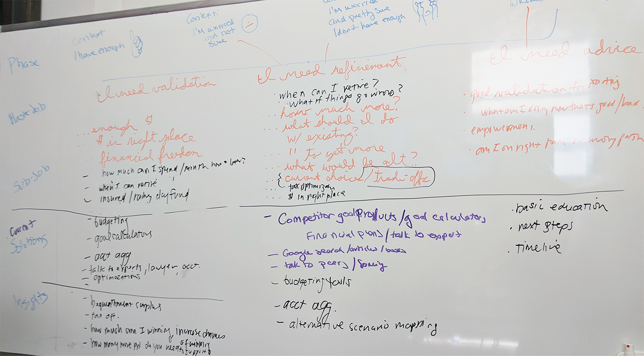
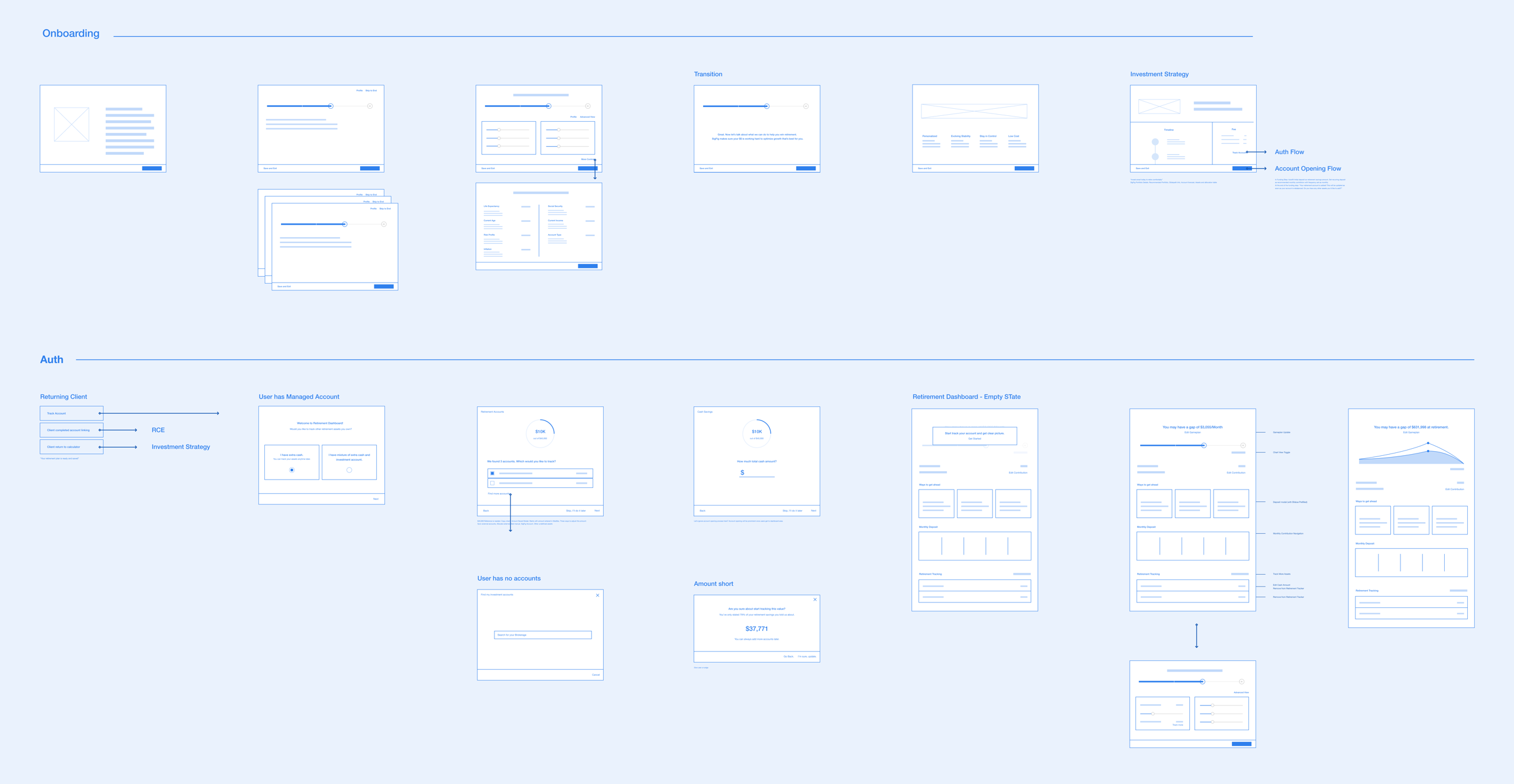
We noticed that even though the idea of saving for retirement was familiar amongst Americans in their 30-50s, the approach was still abstract because it was a concept that is far in the future. Before we lead them with a solution, we needed to let users understand whether they have a problem to solve or not. Following this structure, we created the user flow that first informs users where they stand, then explores ways to close the gap, followed by the actions that they can take.
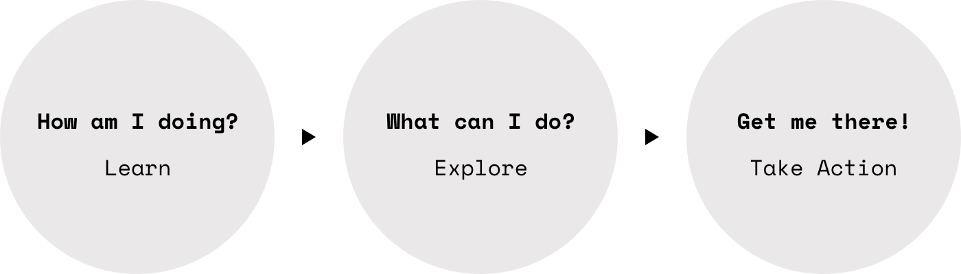
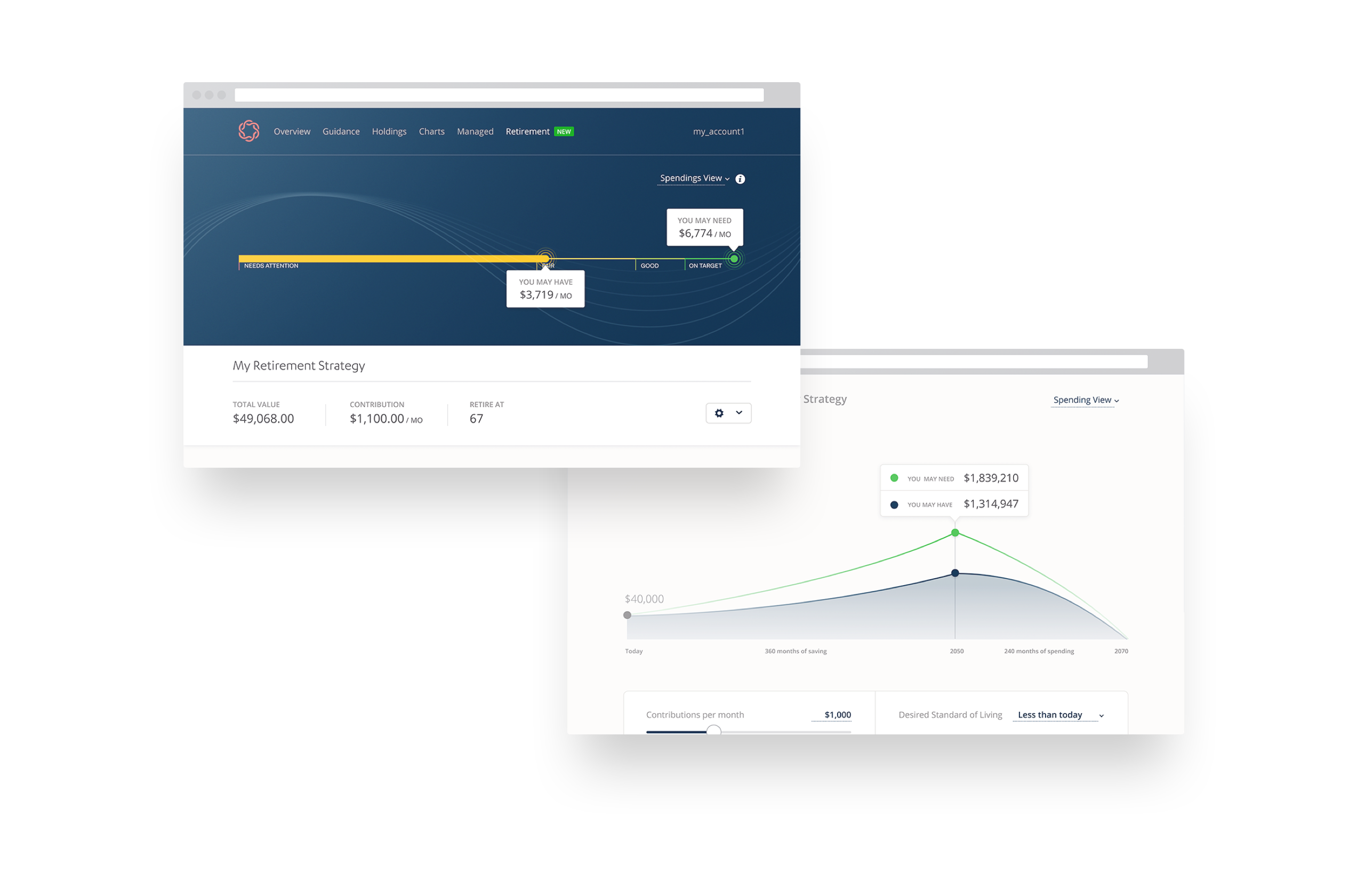
Clients see where they stand by typing information about their retirement and current savings habit. In the next step, they can review where their savings will take them to. Then in the calculator step, they can explore options. Then, they can decide to take the next step or choose to postpone the action step. In the return client experience, we reinforce the story by showing where they stand, providing an option to take action.
When we shared the prototype, we observed strong emotional reactions from the users, which varied based on their progress on retirement. After this, we pivoted the direction to provide messages that respond to what clients are experiencing emotionally.

When you search for retirement calculator, you can find a lot of resources which are often complex and difficult to understand. There are reasons that cause this.
So, instead of attempting to achieve everything in one go, we decided to explore a step-by-step experience. Also to reduce amount of new information and visual components, we spent time to develop a visual that can be transferred over throughout the whole experience, including the onboarding design to the return client experience.
Also, as part of design exploration, I prototyped a transition between two pages, retirement dashboard and investment strategy page. One shows an accurate representation of their investment projection that tracks the progress real-time and the other one allows clients to tweak their strategy. To bring over the key visual component yet separating the two states, I explored a transition inspired by a curtain call on a stage.
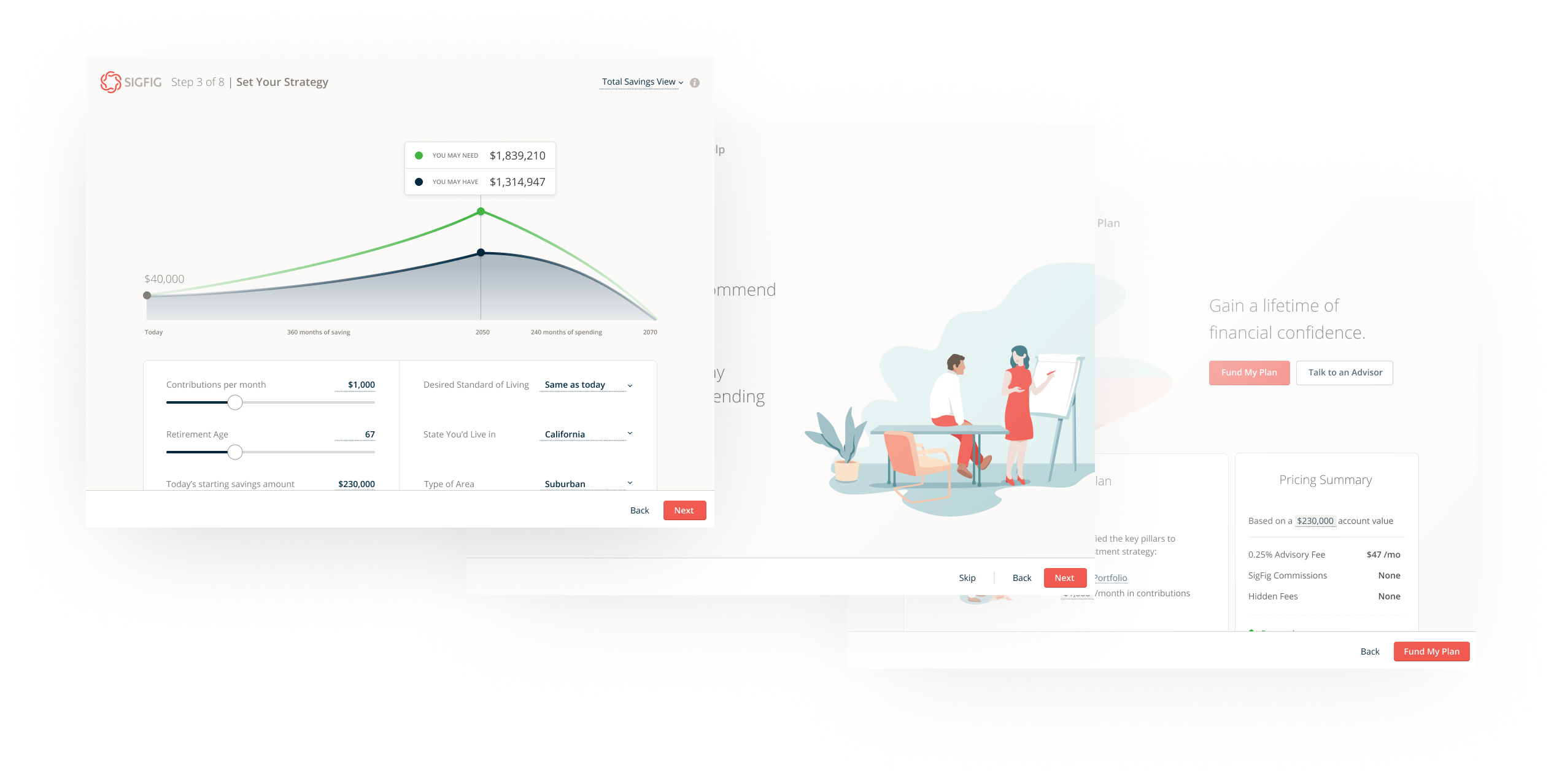
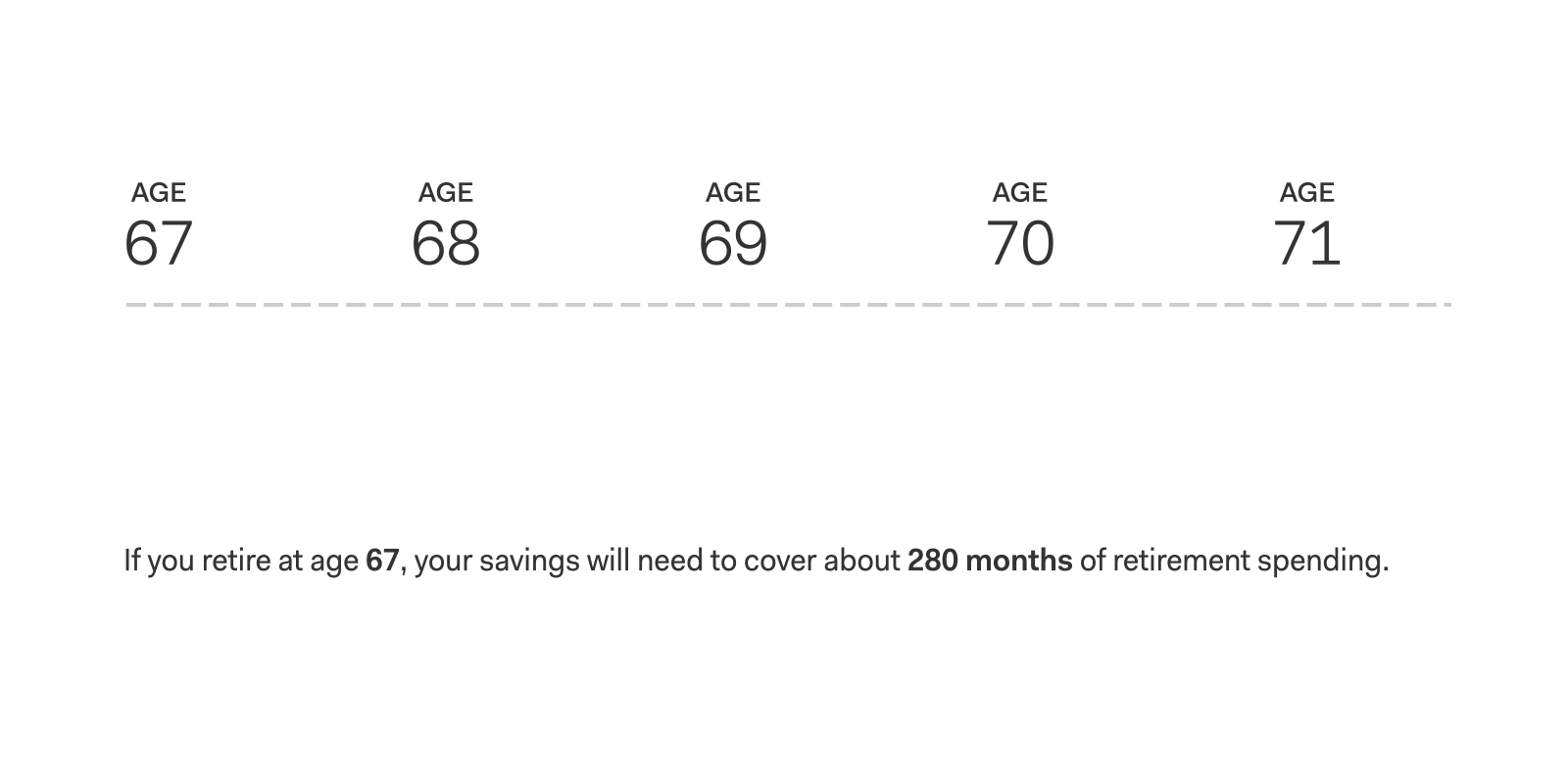
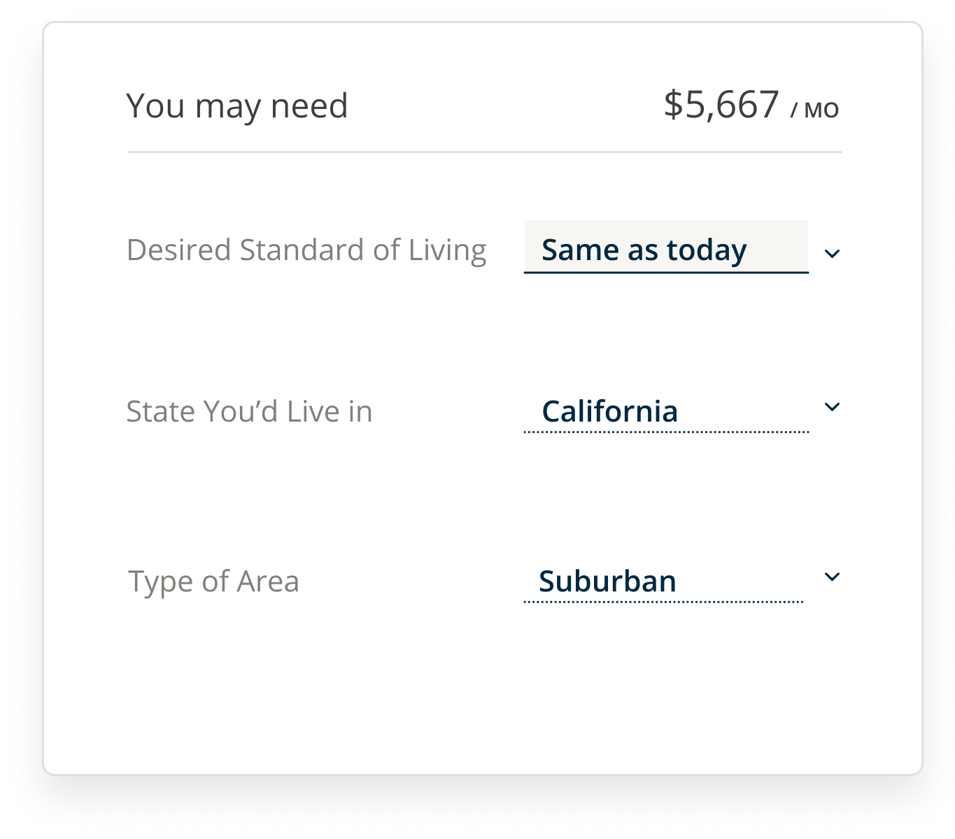
As part of the onboarding experience, we provide users with retirement calculator where they can explore and view the impact of their finances as well as the levers that impacts their future target amount. Instead of directly asking users for the amount, we help them figure that amount out. In the experience we carefully defined levers that are exposed and that are behind a click, making sure providing controls on user's hand without overwhelming them with jargons.


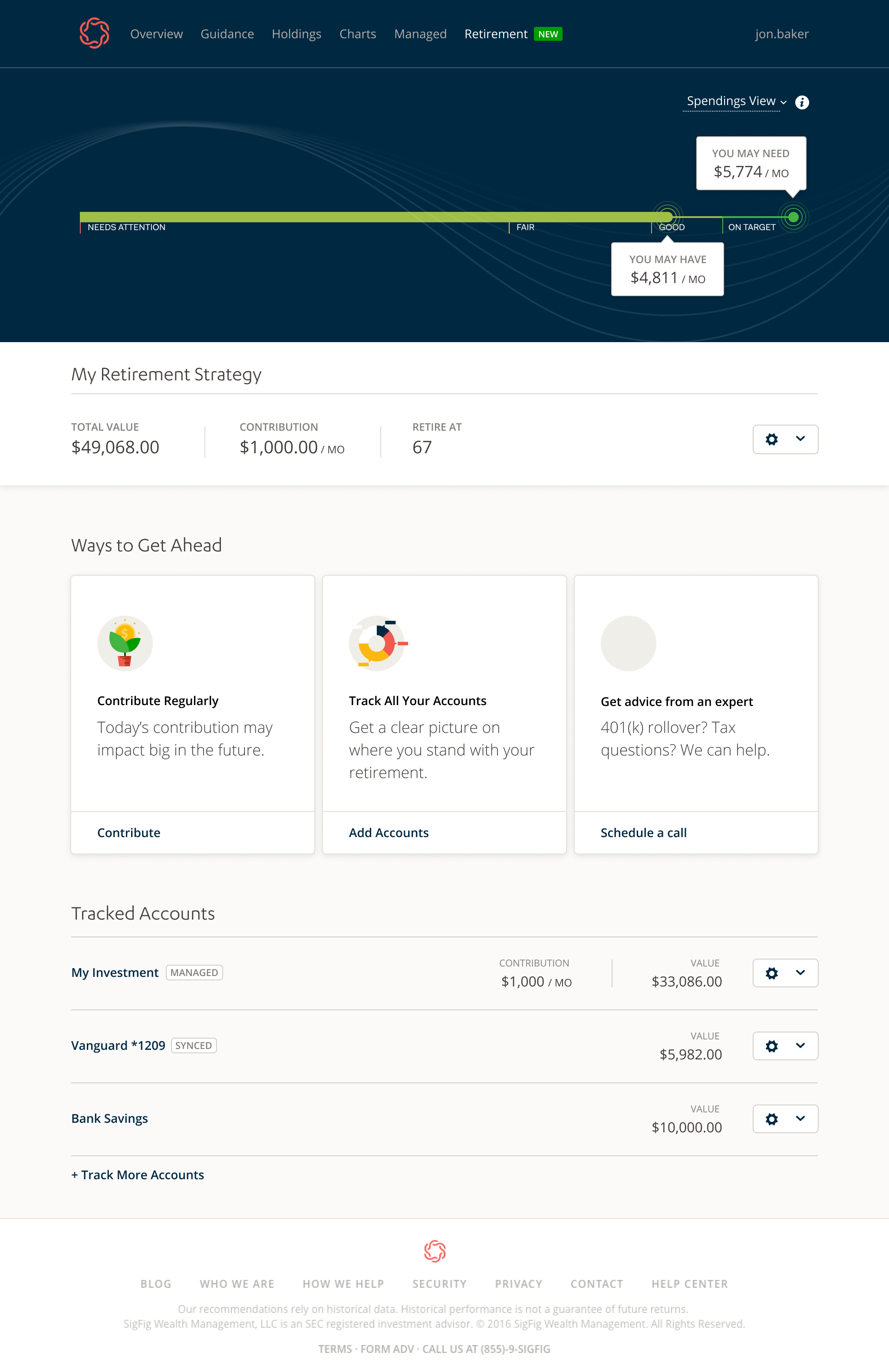
Once we onboard a client on to retirement strategy, we introduce a place where clients can view their retirement assets along their target. In this process, it is important for the users to understand that the information here reflects what they currently have. We've set a path to guide users to link their accounts into the experience.

Close to launch, we ran a usability research with people with various stages in their retirement to learn. After the launch we observed user engagement of the experience. From these observations, it was clear that the client engagement was stronger than the onobarding experience as is. However, there was no strong correlation between the onboarding and the client sign ups. Following are some of the lessons we learned in the process.
Clients may have different expectations about their retirement. It is important to communicate the limitation of the tool and make sure clients understand that it won't cover all the different scenarios.
User comments around the onboarding experience was that it was friendly and easy to understand. However, as soon as they get into retirement strategy and started thinking deeply about their situation they asked for more details and started asking questions.
Especially when clients don't think they are ready enough or they don't know what they can do. Providing small nudges that can be impactful in a long run was key.
Investing is not always in the mind of users when it comes to retirement. It's simply a feature, which makes people uncomfortable. We needed to be very clear about when we transition the clietns into the advantage of investing.
User experience design process for a identity monitoring service.